
Overview
Onsee is a cycle technology company whose mission is to enable cyclists to navigate more safely and comfortably, and encourage people to cycle more.
Their product ecosystem comprises an app and a hardware product, ‘REBO’ – a dash cam and smart bike light. Users will capture footage from incidents and share on Onsee’s app to build a map of data that informs cycle route planning, infrastructure design and ultimately helps to create more sustainable and cyclist-friendly cities.
My role
As sole product designer, I led the entire design process, including user research, ideation, testing and prototyping. I worked closely with stakeholders throughout to communicate design decisions.
Duration
3 months (Jan 2022 – April 2022)
Tools
Figma, Miro, Notion, Slack, Zoom, Pen + paper
The problem
City cycling is often unsafe, and the distribution of data or footage from dash cams isn't used effectively to improve safety.
Data from cycling-related incidents is often not easily accessible to cyclists, local councils or governments. By making this information readily available, we can not only help cyclists feel safer on the road, but also alert key decision-makers of any recurring problem areas. Through Onsee, users will actively contribute to crowdsourcing a map of issues, ultimately driving initiatives for improved infrastructure in urban cities.
The solution
Onsee enables cyclists to share incident footage and access reports of other incidents along their route, so that they can navigate more safely.


background
The Onsee app will seamlessly integrate with REBO, a dash cam and smart bike light. Riders can simply click the ‘bookmark’ button on REBO just after an incident. REBO records a ‘bookmark’, providing an instant replay of 1 minute pre and post button press without the need for editing. Location, speed, plate numbers and other crucial information are automatically captured alongside the footage and uploaded into the user’s files in the Onsee app for easy review.
Stakeholder research
Meeting the co-founders for stakeholder interviews provided invaluable insights into their strategy, overarching business objectives and vision for success.
In summary, they aim to promote more cycling and enhance cyclist safety. Success, to them, meant fostering a community where cyclists felt motivated to use Onsee and REBO daily, creating a sense of mutual support. They envisioned their product contributing to the development of safer and more sustainable cities, starting with a focus on the London and UK markets before expanding to Europe and beyond.
Competitor analysis
Analysing both direct and indirect competitors gave me a broader view of the existing landscape.
Two direct competitors offer a similar product and service to the target market, building cycling incidents into maps in a similar way that Onsee aims to. However, they lacked the efficiency that Onsee would provide, for instance, with editing footage, and are only available as web platforms.
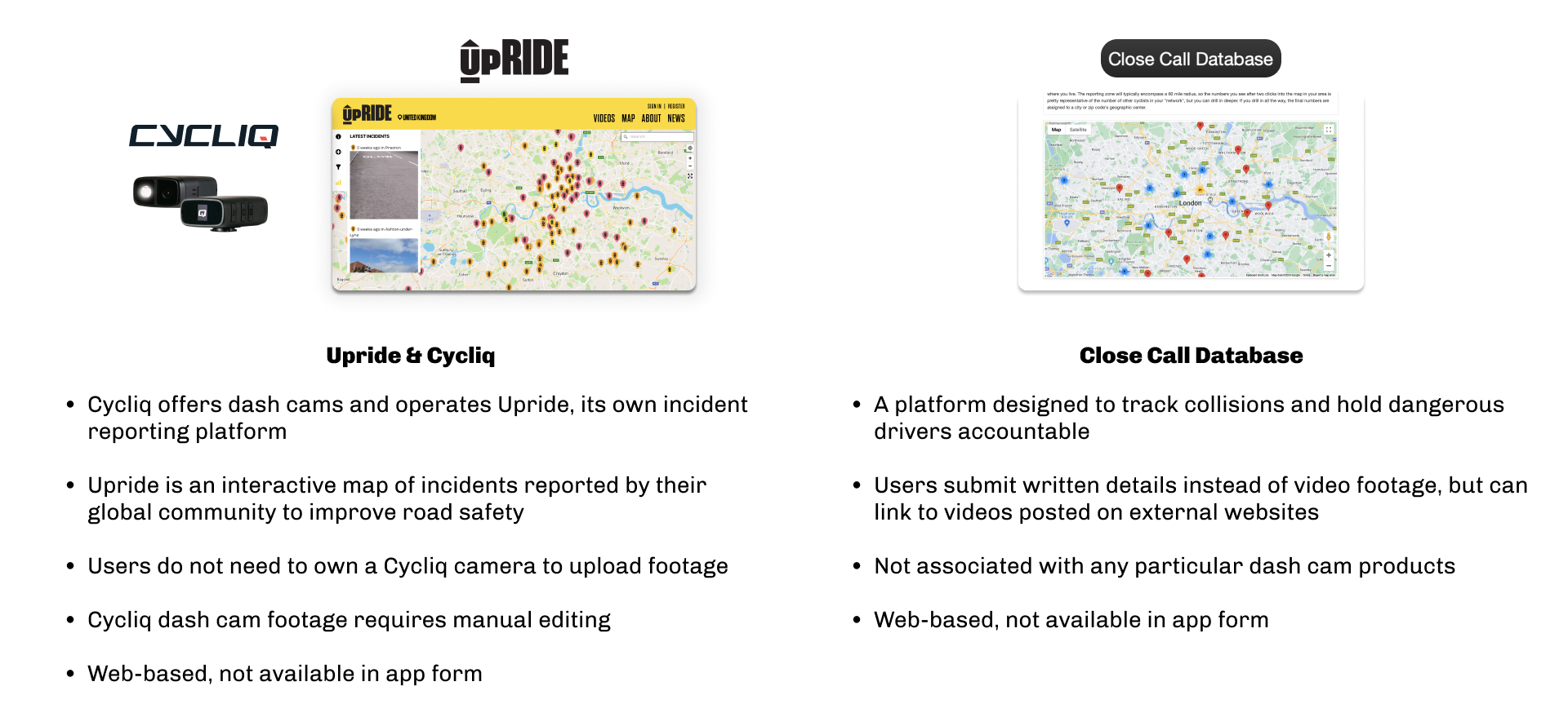
I then looked at three indirect competitors with different products that fulfilled similar user needs. Strava and Komoot, while targeting leisure cycling more than road cycling, provided useful insights into the apps cyclists currently use. Waze was interesting to examine due to its similarity to Onsee in sharing incidents for route planning, but tailored for drivers. Though these apps don't focus on enhancing cycle safety through incident tracking, they helped me understand key functionality in cycling and navigation apps.

USER RESEARCH
A screener survey helped to identify cyclists and further understand their behaviours.
I shared the survey in cycling communities and forums to reach the target users and managed to collect responses from 46 participants.
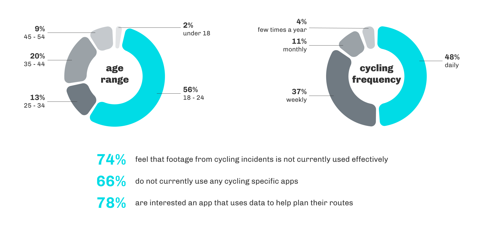
I selected five cyclists for in-depth user interviews, conducted virtually.
In these interviews, I wanted to gain more insight into their:
cycling habits
views on using dash cams
experiences with close calls and incidents
thoughts on safety when cycling
use of apps related to cycling
Affinity map
I then put together an affinity map to consolidate the main themes and trends.
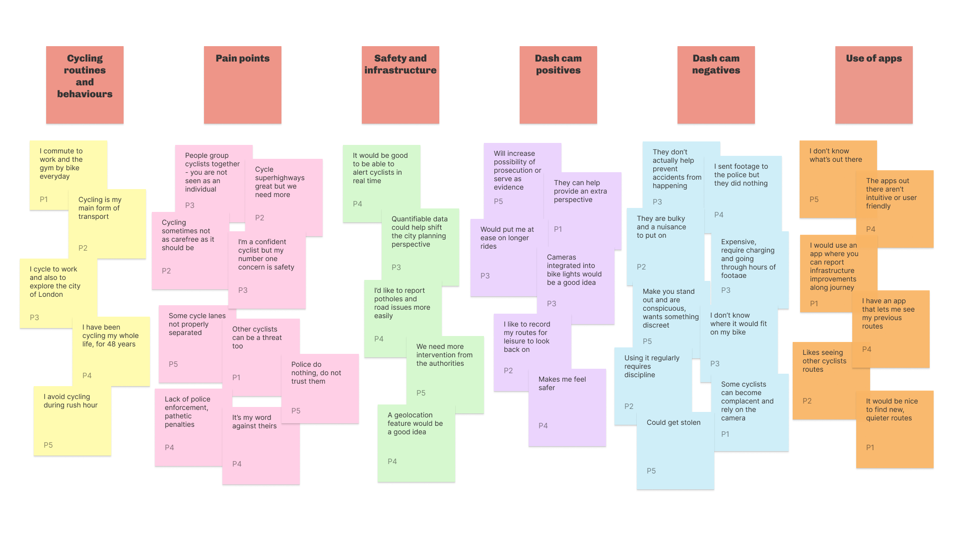
Key insights:
Current processes for reviewing and sharing footage are inefficient
Widespread dissatisfaction with police and investigative procedures
Mixed opinions on dash cams, with some users encountering recurring issues
Lack of centralised access to and storage of dash cam data
Limited awareness of cycling apps; lots of opportunity for existing apps
PERSONAS & USER STORIES
Two very different personas: the cyclist and the local councillor.


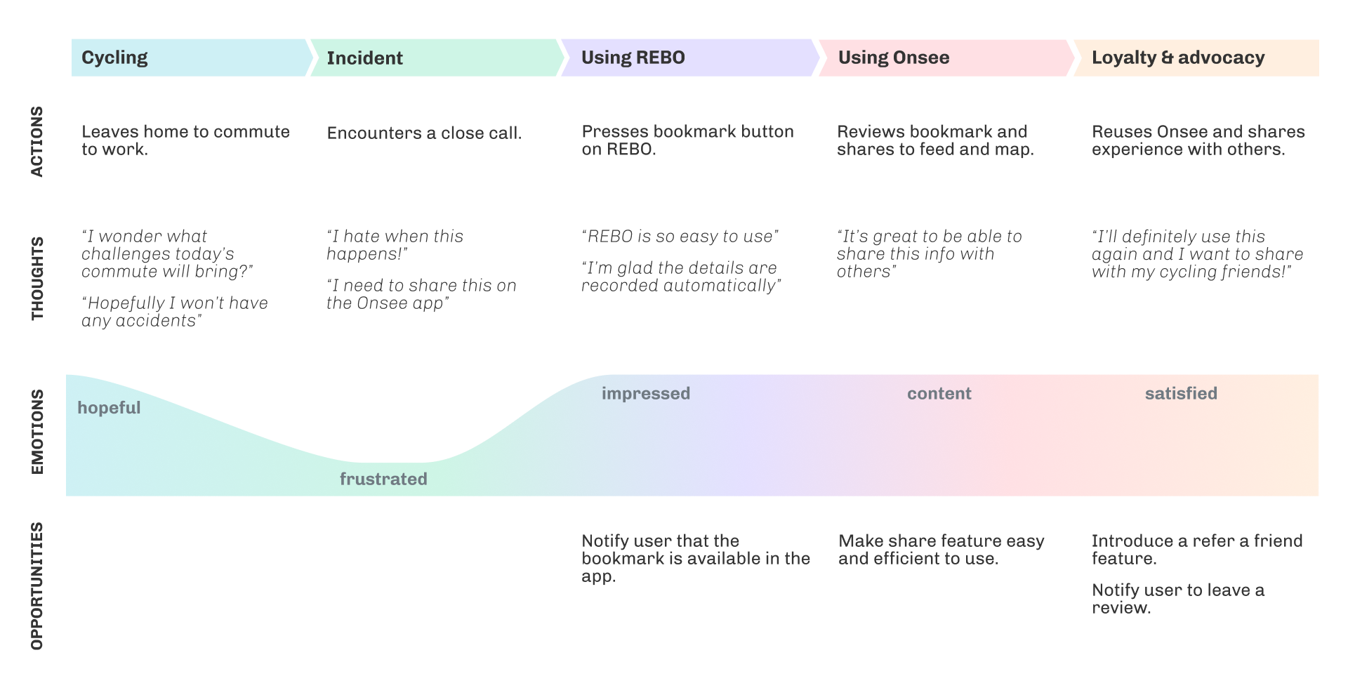
Experience map
Experience mapping helped to outline the user journey.
This served as a visual representation of the entire user interaction and experience, helping me to analyse the various user emotions and touchpoints and identify the opportunities.
USER FLOWS

User flows illustrated paths users would take to accomplish tasks, offering insights for improving user experience.
HOW MIGHT WE?
How might we make footage from cycling incidents more accessible and actionable to promote safer navigation, foster community collaboration, and contribute to sustainable urban planning?
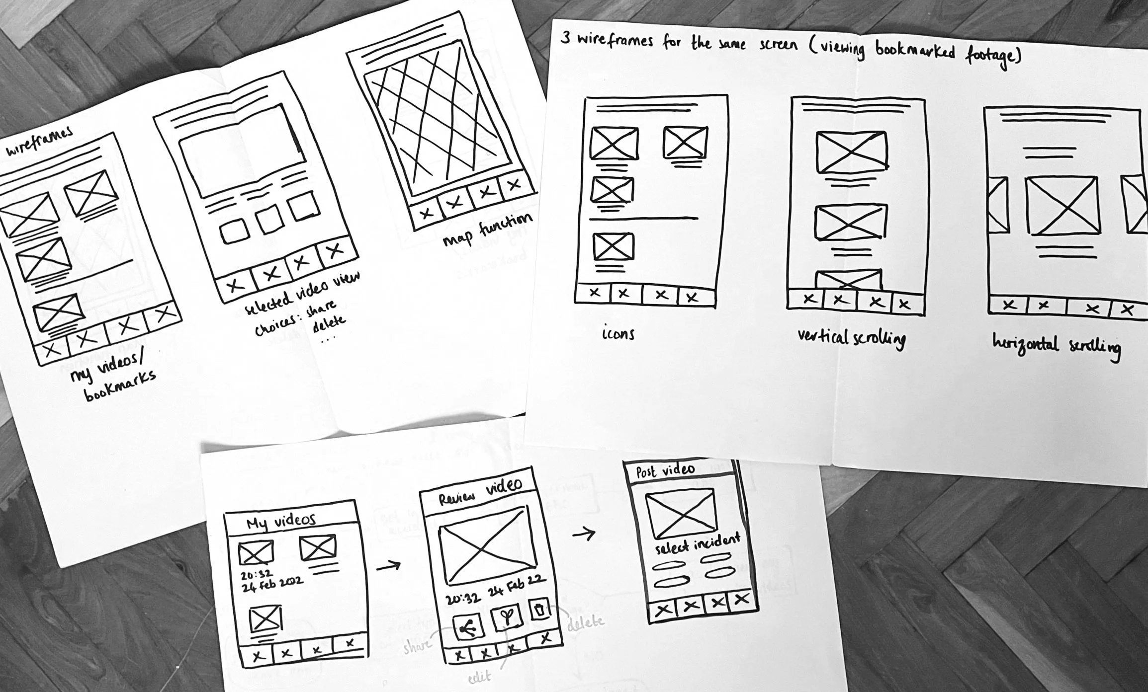
Initial Design
I first sketched out the wireframes on paper.
This allowed me to translate user flows into separate screens that would form the basis of Onsee’s app. These sketches helped me to establish the early design ideas and required functionality before translating them to mid-fidelity wireframes.
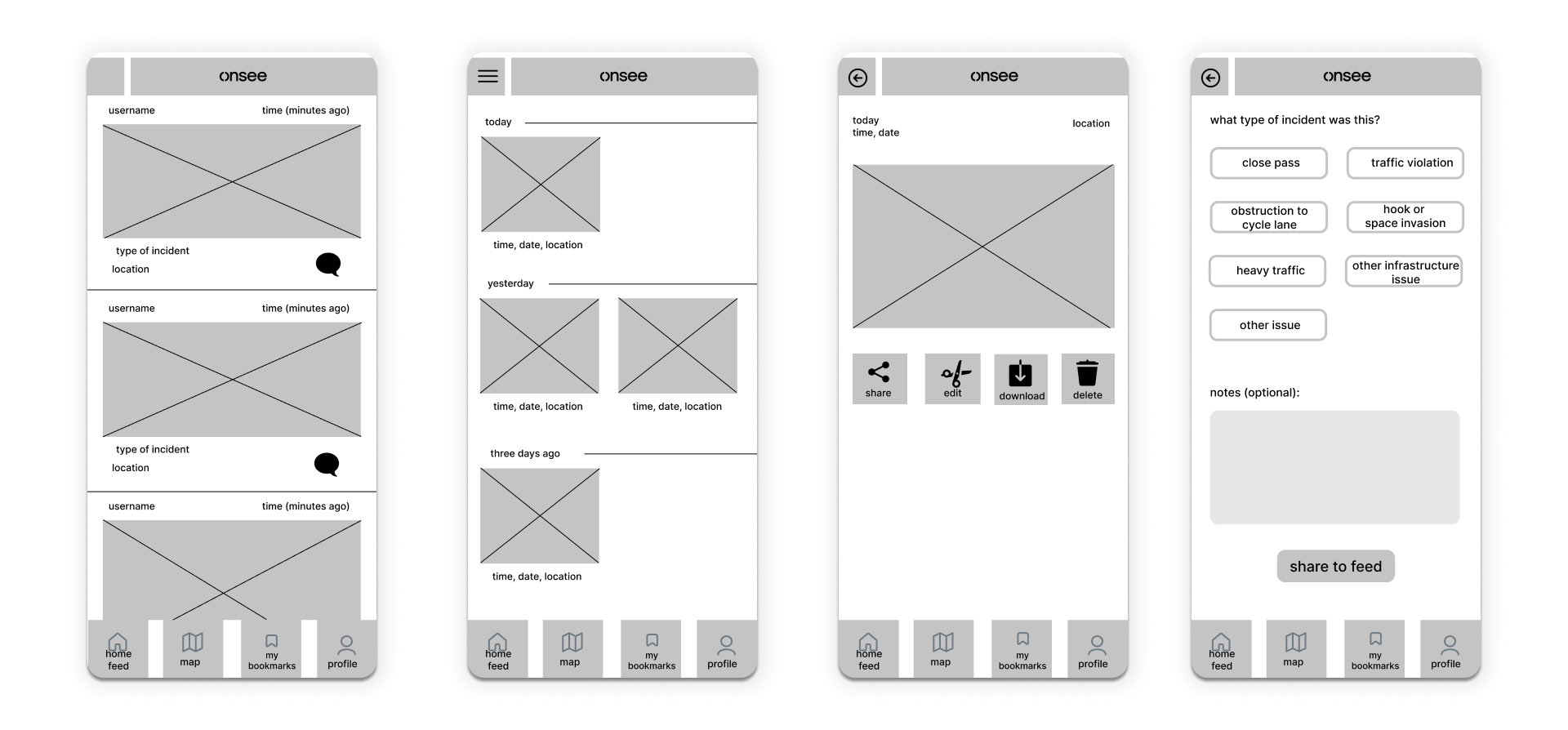
Moving onto mid-fidelity wireframes.
At this stage, I began to further explore the design elements and icons for potential integration.
Usability testing
During testing, users found the process straightforward and self-explanatory.
Before moving to high-fidelity design, I tested an interactive mid-fidelity prototype with 8 potential users. On observation, users were comfortable navigating between screens and completing the tasks set. The response was generally positive, with users also sharing a few suggestions.
Feedback included:
Adding a filter feature to allow users to filter home feed by factors like distance, incident type or number of interactions
Adding a notification that alerts users to visit the bookmark area of the app
Adding a notification page where users can see how others are interacting with their uploads
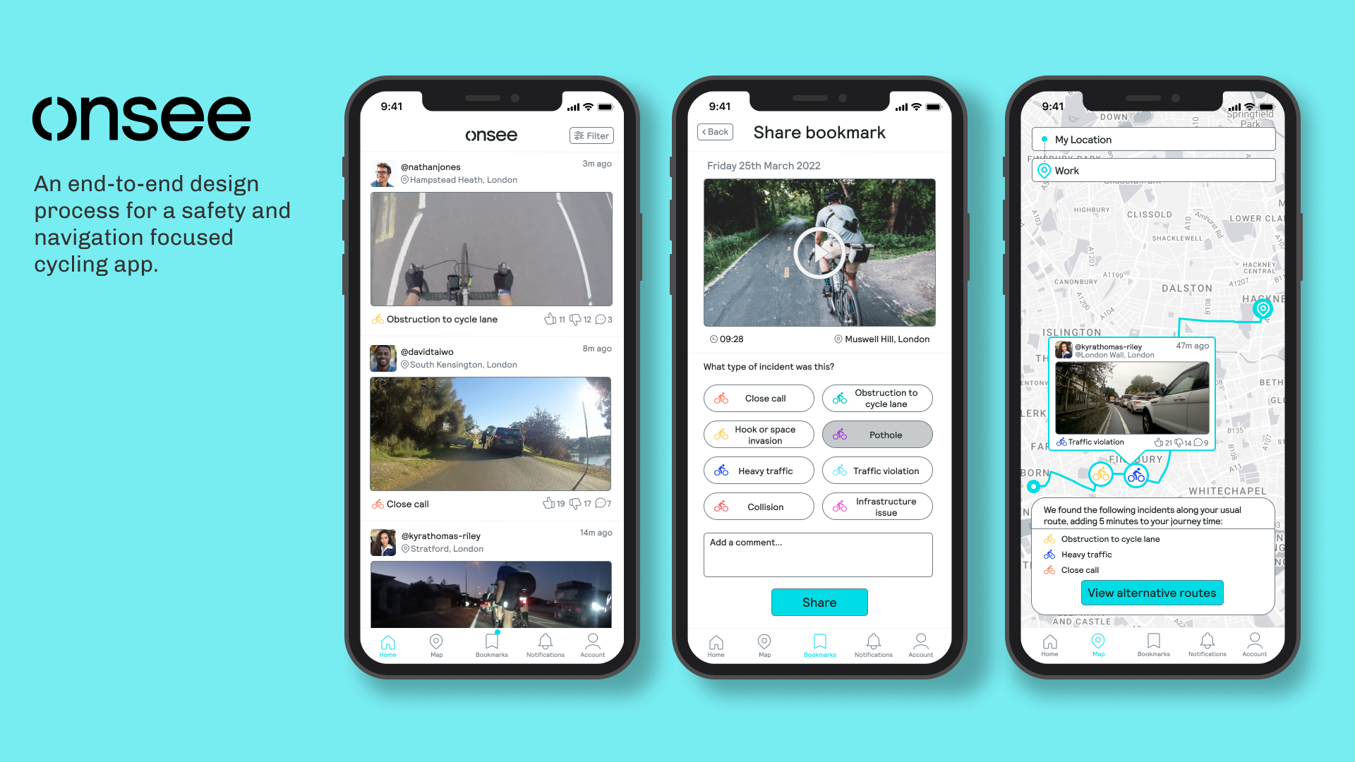
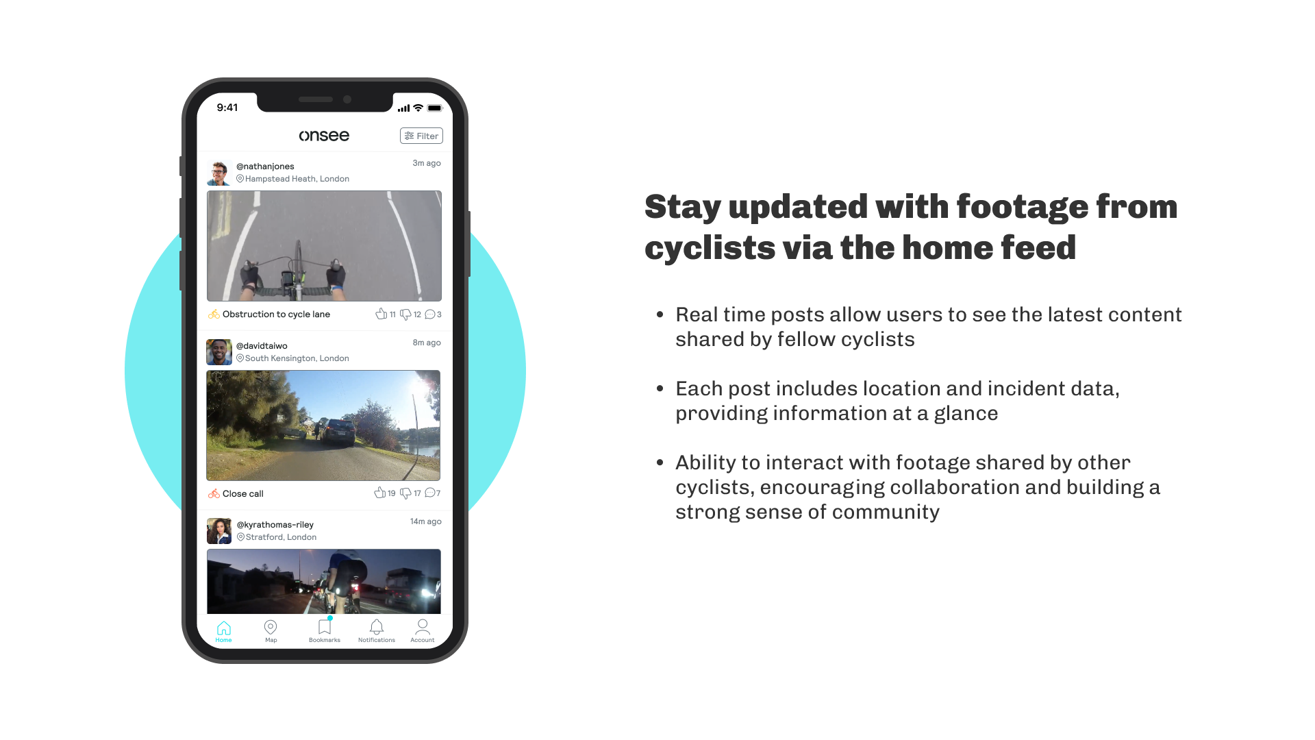
High-fidelity design
The final designs.
Onsee’s design system includes established brand colours and typography that I ensured to maintain throughout the visual design process.
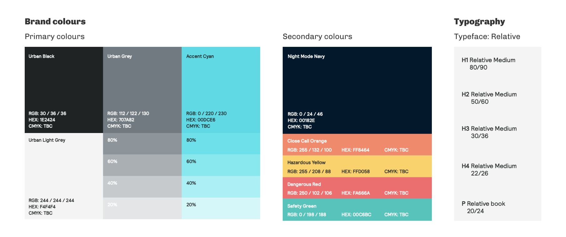
To keep the interface user friendly, I recreated familiar elements and patterns seen in similar apps, aligning with heuristic principles. I used ‘Accent Cyan’ throughout for key elements and highlighting active states.
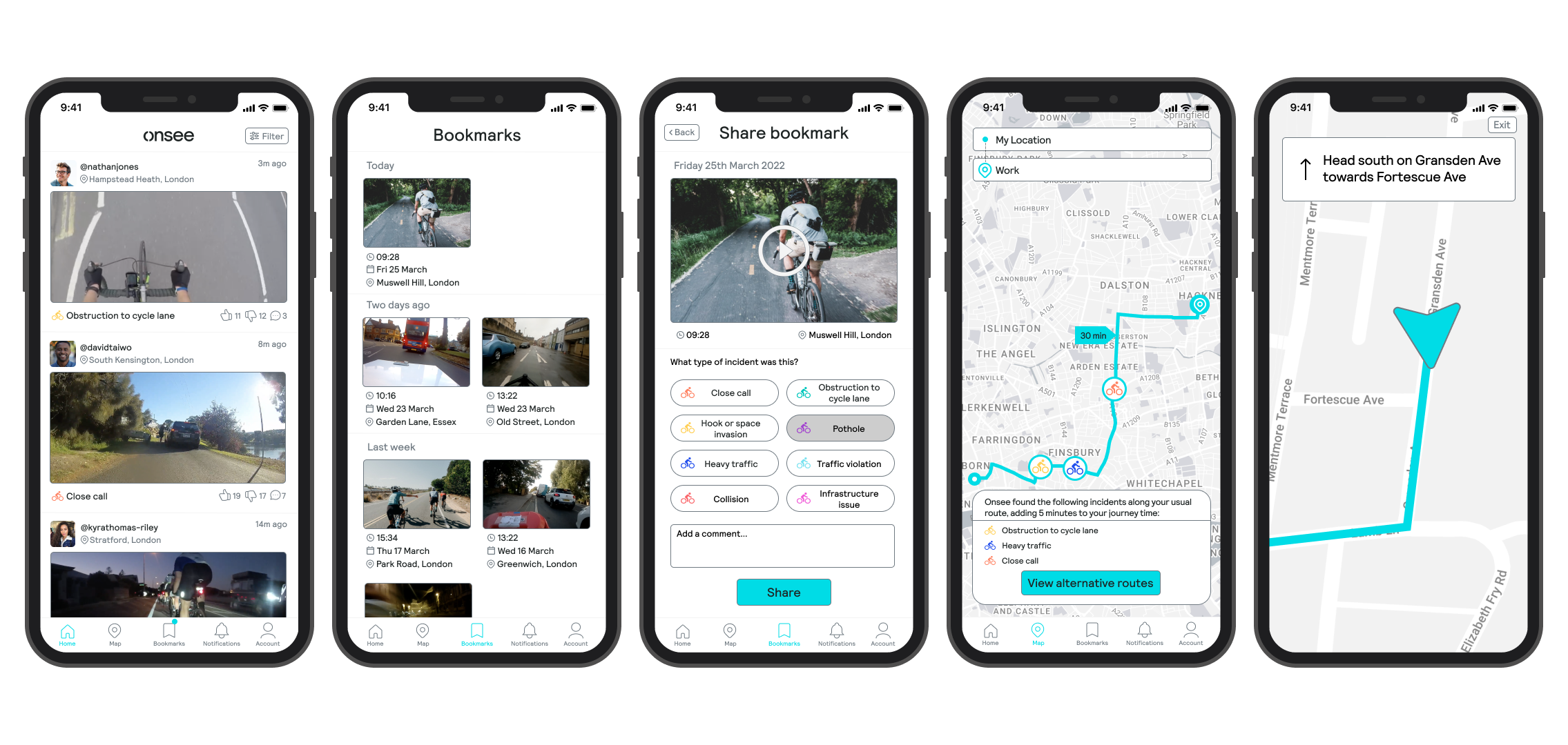
Reviewing a bookmark and sharing it to the home feed with the relevant incident details:
Finding a cycling route to work with fewer obstructions:
Switching to ‘night mode’ to reduce eye strain in low-light environments:
Stakeholder testimonial

Feedback from Crispian Poon, Co-Founder & Director at Onsee:
“Well done again for the presentation and your work, you did brilliantly and met the objectives of the brief very well. It was a pleasure working with you - hopefully we'll bump into each other again in the future!”
Success metrics & KPIs
Although not currently live, my estimated KPIs would include:
Number of users using Onsee daily
Volume of incident footage being shared
Percentage of users engaging and interacting with incident footage on their feeds
Frequency of incident footage uploads per user
Number of routes planned and saved in the app
Percentage of users who continue to use the app over time
key takeaways
My reflections:
This was my first ever UX UI project! — it was amazing to complete an end-to-end design process and learn all of the different phases that it comprises. I learned to really appreciate and value all of the steps that lead to the creation of a design, from research to ideation to iteration and more.
Analysing indirect competitors — looking at an app like Waze proved to be a useful exercise, because in a way it does some of the things that Onsee aims to do, but serves a different market (drivers). The analysis offered a different perspective and inspiration, allowing me to adapt broader concepts from another product and make them fit for purpose.
Iterate, test, re-iterate — after the testing the mid-fidelity wireframes, I was able to implement new useful features following the feedback I received. This highlighted the value in testing and iteration as a part of the design process. I didn’t get a chance to do any further testing beyond this, due to time and scope limitations, but I look forward to doing more of this in my future work.
The art of storytelling — presenting my designs to the co-founders was a pivotal moment in this project. I learned to effectively communicate design decisions and the user journey through storytelling. By presenting a clear narrative, I engaged stakeholders, highlighted my design's value, and built their enthusiasm for the project. This experience highlighted the importance of storytelling and presentation skills in articulating a design project's vision and impact.
MumEase: Innovating a digital solution that supports single mothers living in poverty.
Thank you for reading! Click on a case study to view another 🚀
⇔

NoUrPC: Creating a digital service to improve young people’s perception of the police.